
Layout of printed books
The layout of printed books is the process of arranging text, images and other elements on the page so that the book is comfortable to read and aesthetically attractive. We carry out the full cycle: from preparing the mock-up and structuring the content to checking the layout and preparing the files for printing.
- Preparation of the mock-up and the structure of the edition
- Text formatting and placement of images
- Running heads, page numbering and table of contents
- Checking and correcting the layout before printing
- Print-ready files: PDF, CMYK, 300 dpi
At a time when e-books are becoming ever more popular, the layout of printed books is still an important art. Book layout is the process of arranging text, images and other elements on the page in such a way as to create a high-quality and attractive product. Like an electronic version, a printed book has to be not only informative but also aesthetically pleasing for the reader.
- Basic concepts of book layout. Book layout covers several important aspects, from preparing the layout to the final printing. It includes the choice of typeface and font size, the placement of images, the design of headings and sections and other aspects. Correct layout not only makes the book easy to read but also creates a single style and atmosphere for it.
- The layout process. The first stage of layout is preparing the mock-up. Here the overall appearance of the book is determined and the format and the arrangement of the text on the page are chosen. Then comes the placement of text and images. The text has to be formatted correctly, taking paragraphs, alignment and font styles into account, and the images have to be inserted and set up correctly as well.
- Features of the layout of printed books. The layout of printed books has its own particularities depending on the type of book. Textbooks, for example, may contain a large number of graphic elements and tables that need special attention during layout. Fiction may require a special design style to emphasise its literary value. Illustrated books can be more complex to lay out because of the large number of images.
The layout of printed books is a complex process that requires attention to detail and professional skills. A properly designed book makes a pleasant impression on the reader and strengthens the perception of its content.
The importance of layout in the publishing process
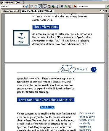
Layout plays a key role in creating quality printed publications. It not only determines the appearance of the book but also influences how the reader perceives it. Let us look at the importance of layout in the publishing process, the general rules of book layout and the technical aspects of page layout.
- Aesthetics and readability. The layout determines the appearance of the book, making it attractive and easy to read. The correct arrangement of text, fonts and images provides a harmonious and pleasing visual image.
- A professional look. A well-designed book inspires confidence in the reader and emphasises the professionalism of the publisher. This matters for both personal and corporate editions.
- Compliance with standards. The layout has to comply with typographic and design standards to ensure a high-quality printed publication. This includes the correct use of typography, font sizes, spacing and so on.
General rules of book layout
- Choosing the typeface and fonts. To keep the book readable, classic fonts should be chosen. The font size and the spacing must be comfortable to read.
- Text layout. The text should be justified or aligned to the left margin so that it is easy to read. Paragraphs should be clearly marked and separated from one another.
- The use of styles. Styles make the formatting of the text uniform and simplify editing. They also help to create a single style for the whole book.
- Placement of images. Images should be inserted into the text correctly, with proper indents and captions. This avoids overloading the page and keeps it readable.
Technical aspects of page layout
- Page formatting. The page layout has to be adapted to the specific format of the book, taking into account the page size, the margins, the page numbers and other elements.
- Preparation for printing. Preparation for printing must take into account the printing house’s requirements for resolution, colour reproduction and file format.
- Quality control. After the layout is finished, quality control should be carried out to make sure that the text looks correct on all pages and matches the design of the book.
The first stage: preparing the mock-up for the layout of printed books
The first stage of layout is creating the basic page mock-up. This includes determining the page size, the margins, the fonts, the styles and the placement of elements on the page. It is important to take into account the structure of the book and the placement of headings, paragraphs, images and other content.
Laying out the text of the book
- Breaking the text into blocks. Before starting to lay out the text of the book, it has to be divided into logical blocks. This makes it convenient to organise the placement of the text on the page and keeps it readable.
- Formatting the text. Once the text has been divided into blocks, it should be formatted in accordance with the chosen style: the typeface, the font size, the paragraph spacing, the text alignment and other formatting parameters.
- Placing images and other elements. After the text has been formatted, images, tables, graphics and other elements have to be placed on the page. It is important to choose the right place for every element so that the page looks aesthetically pleasing and the information is easy to take in.
Structuring the content
- Working with chapters and sections. Structuring the content includes working with the chapters, sections and subsections of the book. This lets the reader navigate the material easily and find the necessary information quickly.
- Creating the table of contents. After the layout of the text is complete, the table of contents has to be built. This lets the reader find the information they need quickly and also makes it easier for authors, editors and publishers to work with the book.
The layout of printed books is an important stage of the publishing process that affects how the reader perceives the text. Correct page design, the choice of fonts, the placement of images and the structuring of the content make the book easy to read and pleasant to take in. It is important to remember the technical aspects of layout as well, such as the choice of software and the preparation of the mock-up, in order to get a high-quality result.
Placing text and images in the layout of printed books
Inserting and formatting text
After the mock-up has been prepared, an important stage begins – the placement and formatting of the text. Book layout requires a careful approach to this process.
- Choosing the font and its size. One of the first steps is to choose a suitable font and size. The font should be easy to read and should suit the style and the subject of the book.
- Spacing and alignment. Paragraph spacing, text alignment (left, right, centred or justified) and indents have to be set correctly for comfortable reading.
- Styles and formatting. The use of styles simplifies the layout process and keeps the text formatting uniform on all pages of the book.
Inserting and processing graphic elements
Graphic elements such as images, charts and tables play an important role in the design of a book and in attracting the reader’s attention.
- Inserting images. Images should be inserted so that they fit seamlessly into the text. It is important to make sure that the resolution of the image and its size correspond to the page layout.
- Processing images. If necessary, images can be processed – resized, cropped, colour and tone corrected – so that they match the design of the book better.
- Inserting charts and tables. Charts and tables should be placed so that they demonstrate the information clearly and do not overload the page. It is important to caption them properly so that the reader can understand them easily.
Placing text and images is an important step in the layout of printed books. Correct formatting of the text and the insertion and processing of graphic elements make the book easy to read and attractive to the reader. The particularities of the specific edition have to be taken into account when choosing fonts, styles and the placement of images in order to achieve the best result.
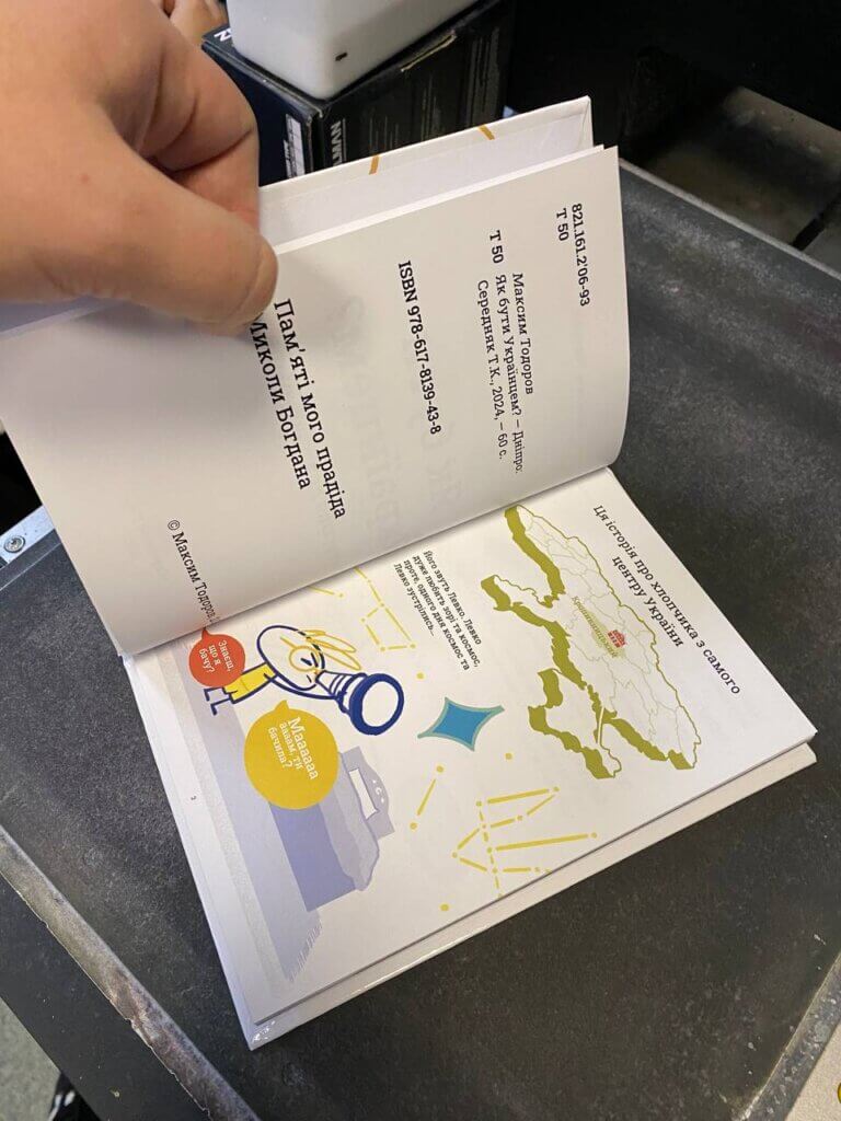
Page design in the layout of printed books
After the text and the images have been placed on the pages of the book, the design stage follows. It includes setting fonts, sizes and styles, and also text alignment and the creation of headings, sections, paragraphs and lists.
Setting fonts, sizes and styles
- Fonts and their compatibility. When designing the pages of a book it is important to choose fonts that are easy to read and pleasing to the eye. Different elements – headings, paragraphs, subheadings – can use different fonts and sizes to emphasise their importance and make the text more engaging.
- Adjusting sizes. Font sizes, line spacing, indents and letter spacing should be set so as to give the text maximum readability.
- Using styles. Styles make it easy to change the formatting of the text throughout the book, which makes the layout process more efficient and convenient.
Aligning text and images
- Text alignment. Depending on the style and design of the book, the text can be aligned to the left, to the right, centred or justified to the width of the page. This helps to create balance and harmony on the page.
- Alignment of images. Images should also be aligned on the page so that they do not break the overall visual rhythm or interfere with reading. Whether they are aligned to the left or right edge of the text, centred or wrapped with text depends on the designer’s preferences and on the features of the layout.
Creating headings, sections, paragraphs and lists
- Headings and subheadings. Headings and subheadings help to structure the information on the page and make it easier for the reader to understand. They should be set in an appropriate font, size and style.
- Paragraphs. Breaking the text into paragraphs makes it easier to read. Designing paragraphs includes setting indents, spacing and text alignment.
- Lists. Bulleted or numbered lists help to highlight key information and make it more organised and easier for the reader to follow.
Working with running heads and page numbering
Once the basic layout has been created and the text has been placed on the pages of the book, work with running heads and page numbering follows. This is an important stage in the layout of printed books, which makes it possible to create a single style and to keep the book comfortable to read.
Adding chapter headings, section titles and subheadings
- Chapter headings. Book layout usually involves adding chapter headings, which are key elements of the structure of a book. Chapter headings are normally emphasised with a larger font or another stylistic device in order to attract the reader’s attention.
- Section titles and subheadings. Besides the main chapter headings, a book may contain the titles of individual sections and subsections. This helps the reader to move through the book more quickly and to find the information they need more easily.
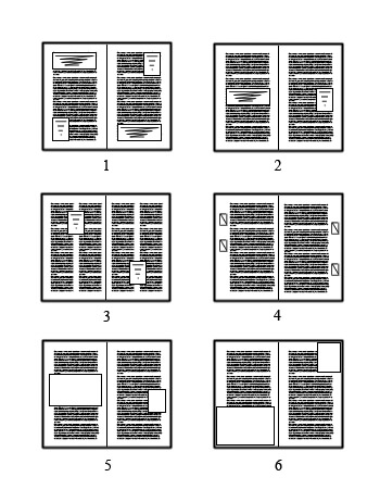
Setting page numbering and running heads
- Page numbering. Page numbering lets the reader move through the book easily and navigate its contents. Page numbers are usually placed at the bottom or at the top of the page, on the right or on the left; in some books they may also be centred.
- Running heads. Running heads are additional information placed at the top or the bottom of the page. They can include, for example, the title of the book, the title of the chapter or section, the author and the page number. They help to create a uniform style of book design and make it look more professional.
Working with running heads and page numbering is an important stage of book layout, because it makes the book readable and organises the information. Adding chapter headings, section titles and subheadings makes the book more structured and clearer for the reader, while page numbering and running heads give the layout a uniform style and make the book easy to use.
Checking and correction in the layout of printed books
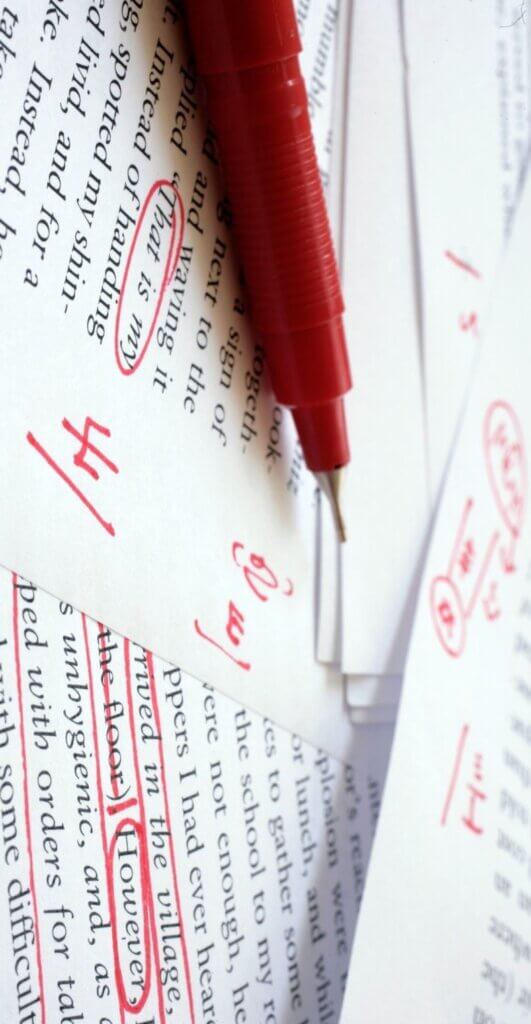
After all the stages of the layout of the book have been completed, it has to be checked and corrected in order to guarantee its quality and its compliance with the stated requirements.
After the spelling and grammar have been checked, the next step is to check the formatting and the consistency of the layout. Even the most experienced authors and typesetters sometimes make typos or mistakes. Automated checking tools such as spell-check programs can be used here, as well as professional proofreaders and editors.
In addition, after checking the text you need to make sure that the page formatting complies with the established rules of book layout. This includes checking:
- Consistency of styles. Make sure that all headings, paragraphs, lists and other formatting elements are consistent with one another.
- Placement of elements. Check that all text blocks, images and other elements are placed correctly and do not break the structure of the page.
- Correspondence to the design. Check that all the elements of the layout correspond to the previously approved design of the book – the design of the headings, the fonts, the sizes and the indents.
Checking and correction are an integral part of the book layout process. This step makes it possible to find and correct errors in the text and in the formatting and gives a high-quality, professional-looking book. Once the check is complete, the book is ready for print or electronic publication and can be presented to readers.
Particularities of the layout of different types of books
Book layout is a many-sided process that requires taking the particularities of every type of edition into account. Different books have their own unique layout requirements, determined by their content, their target audience and the goals of the edition.
Text books mostly contain a large amount of text without many illustrations. The main features of the layout of text books are:
- Page structure. The layout of text books has to be clear and easy to read. The main focus is on the text, so attention is paid to the even distribution of the text on the page and to the use of comfortable fonts.
- Headings and paragraphs. It is important to highlight headings and subheadings in order to make the book easier to navigate. Using different levels of headings helps to structure the information.
Illustrated books contain both text and images. They require more complex layout in order to provide a harmonious combination of text and illustrations.
- Integration of text and images. The layout has to fit the images into the text effectively so as not to break its integrity. This may include placing images with captions, inserting them into the text or creating double-page illustrations.
- Designing image captions. Captions to illustrations have to be clear and easy to read, and their placement has to be logical and to correspond to the context.
Textbooks and reference books require special care in layout, because they are meant to teach and to inform.
- Structure and organisation. The layout of textbooks and reference books has to be logical and convenient to use, so it is important to have a clear separation of sections, subsections and lists.
- Index and annotations. It is important to provide convenient indexes and annotations for quickly finding information and navigating the book.
Technical aspects of the layout of printed books
The layout of books and magazines includes not only the creative process of building page mock-ups but also a number of technical aspects that determine the quality of the materials and their readiness for printing.
File formats and types
- Source files. Adobe InDesign, QuarkXPress or Scribus are often used for book layout. These programs let you create page mock-ups and save them in various formats such as INDD, QXP or SLA.
- Final files. Once the layout is complete, the mock-ups have to be exported to print-ready formats such as PDF or TIFF. PDF is the most common format for printed publications because of its versatility and its ability to preserve high-quality images and text.
Image resolution
- Raster images. When inserting images into book layouts, the resolution has to be taken into account so that the images look sharp in print. Images with a resolution of 300 dpi (dots per inch) are recommended for high-quality printing.
- Vector images. For logos, illustrations and other elements that can be scaled without loss of quality it is better to use vector formats such as AI or EPS.
Preparing files for printing
- Checking the mock-ups. Before sending the mock-ups to print they have to be checked carefully for errors, typos and cropped or incorrectly placed elements.
- Setting the print options. When exporting files to PDF for printing, make sure that the correct settings are selected – the CMYK colour space, the image resolution and the trim options.
- Taking the printing process into account. The layout of a book has to take the features of the printing process into account, such as trimming and safety margins, so that the content is not cut off or distorted in print.
The technical aspects of layout play an important role in creating high-quality printed publications. The correct choice of file formats and image resolutions and proper preparation of the files for printing give the finished edition high quality and a professional appearance.
Current trends in the layout of printed books
As technology advances and readers’ preferences change, the layout of printed books is becoming more diverse and interactive. Let us look at some of the current trends in this field.
- Responsive layout. With the arrival of electronic reading devices such as tablets and smartphones, responsive layout has become relevant. It lets a book adjust automatically to different screen sizes and resolutions, which makes it easy to read on any device without distorting the text or the images.
- Multilingual editions. Multilingualism is more and more in demand in today’s world. Many publishers offer the layout of a book in several languages within one edition. This makes the book accessible to a wide audience of readers around the world and helps to preserve cultural diversity.
- Interactive elements and multimedia. With the development of digital technology the possibilities of book layout have expanded considerably. Books can now contain interactive elements – animations, video and audio files – which make reading more engaging and informative. Children’s books, for example, can contain animations and sound effects, and textbooks can include interactive assignments and tests.
Current trends in the layout of printed books reflect the striving for convenience, accessibility and interactivity. Responsive layout makes books available on a variety of devices, multilingual editions meet the needs of multilingual readers, and interactive elements and multimedia components make reading even more engaging and instructive.
Ready to get started?
Submit your request - a manager will contact you within the day with a detailed quote.